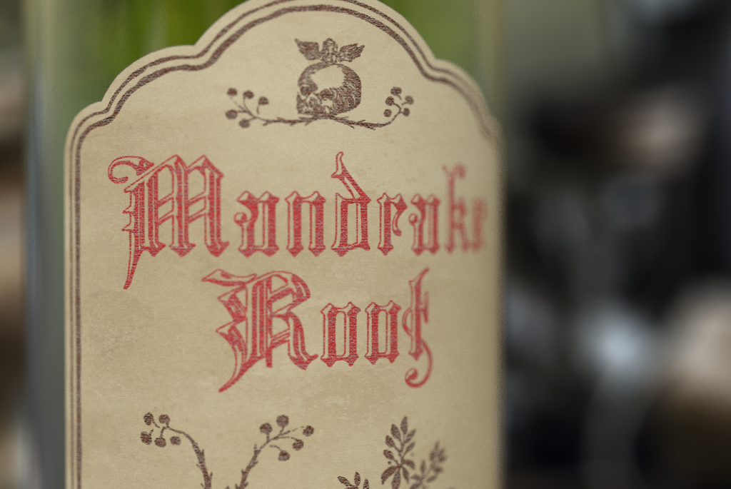
MANDRAKE ROOT
This packaging was for an artisanal spiced absinthe brand. When I thought of absinthe and the wormwood used to make it, I got witchy, apothecary vibes and decided to give the brand a medieval witch’s theme. The brand was given the name Mandrake Root after a mythological ingredient used in witches’ brews. This theme was realized through the use of texture, found historical imagery, and gothic typography as well as the choice of bottle and label shape.
Art Direction: Paul Sheriff


