CHESSEX REBRAND
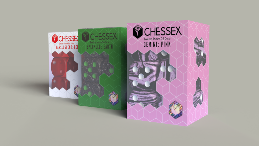
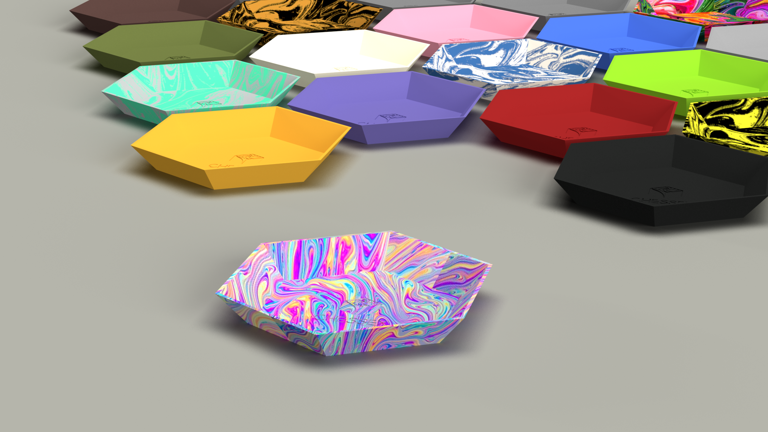
For this rebranding project I chose the gaming dice brand Chessex. Their existing branding was boring and dated, and I wanted to create a branding system that reflected their fun and colorful products. I played with the idea of the dice acting as portals to the worlds gamers immerse themselves in. I also wanted to put an emphasis on the geometry of the various dice. Both of these concepts are reflected in elements like the “portal cube” logo and geometric windows on the packaging.
Art Direction: Rodd Whitney


